Data visualization using graphs and charts is one of the key requirements in many projects. In this article, we will explain how we can create a LineMarkSeries graph using the React-vis library. This library is a feature-rich and highly customizable visualization library for React that was created by Uber.
This library supports various types of graphs, such as Line series, Bar chart, Pie chart, Heatmap, Contour series, Circular gridlines, Radial Chart, Treemaps and many more graphs with various features. More information is available at React-vis (https://uber.github.io/react-vis/).
Problem Statement : In one of our projects, we were required to show a Line series graph with tooltip and markers at intersection points in the graph. For this purpose, we had two options: Line Series and Line Mark Series in React-vis library; since Line series did not have an interception indicator feature, so we chose Line Mark Series to create our graph. Another problem was handling mouse hover event in the graph, i.e., showing tooltips whenever we move the mouse to the intersection of X-Y lines.
Solution: To create the Line Mark series graph we follow the below steps:
Step 1: Installation of Library: We need to install react-vis using the npm package manager npm install react-vis
Step 2: Import XYPlot & LineSeries
XYPlot – React vis works with XYPlot. XYPlot allows you to make line charts, area charts, scatterplots, heat maps, etc. with animations and different interactions between them.
- For XYPlot we need to specify the Height and Width.
- XYPlot is a wrapper of all charts and series.
- Each series needs to pass data property.
Sample Code : In the below Sample code, we are explaining how we can create a LineMarkSeries graph using the react-vis library.
import React from 'react';
import './style.css';
import React from 'react';
import Charts from './charts.js';

export default function App() {

  const data = new Array(19).fill(0).reduce(
    (prev, curr) => [
      ...prev,
      {
        x: prev.slice(-1)[0].x + 1,
        y: prev.slice(-1)[0].y * (0.9 + Math.random() * 0.2),
      },
    ],
    [{ x: 0, y: 10 }]
  );
  return (
    <div>
      <Charts data={data} />
    </div>
  );
}
The first step is to prepare datasets which we will bind with a chart; this is a very basic dataset having data points for our Line Mark series (X and Y co-ordinates).
 import {
XYPlot, XAxis, YAxis, VerticalGridLines, LineMarkSeries
} from 'react-vis';
The next and final step is to create a chart component and pass the dataset to child components. The chart component is a functional component because it has no state.
import React, { useState } from 'react';

import {
  XYPlot,
  XAxis,
  YAxis,
  VerticalGridLines,
  HorizontalGridLines,
  LineMarkSeries,
} from 'react-vis';


const Charts = (props) => {
  const dataArr = props.data;
  const [hintValue, setHintValue] = useState(undefined);

  const _forgetValue = () => {
    setHintValue(undefined);
  };

  const _rememberValue = (value) => {
    setHintValue(value);
  };

  return (
    <div>
      <XYPlot
        xType="ordinal"
        width={920}
        height={330}
        style={{
          border: 1,
          borderColor: '#c9c9c9',
        }}
      >
     <HorizontalGridLines style={{ stroke: '#c9c9c9' }} />
     <VerticalGridLines style={{ stroke: '#c9c9c9' }} />
     <XAxis
          style={{
            fill: '#49454a',
            fontSize: 14,
            letterSpacing: '0.16px',
            fontWeight: 'normal',
          }}
          width={1}
          orientation="bottom"
          tickSize={10}
          tickPadding={20}
        />
        <YAxis
          style={{
            fill: '#c9c9c9',
            fontSize: 12,
            text: { stroke: '' },
            letterSpacing: '0.16px',
            fontWeight: 'normal',
          }}
          left={20}
          tickPadding={10}
          height={500}
        />
        <LineMarkSeries
          onValueMouseOver={_rememberValue}
          onValueMouseOut={_forgetValue}
          className="linemark-series-example"
          style={{
            strokeWidth: '3px',
            fill: 'transparent',
          }}
          lineStyle={{ stroke: 'red' }}
          markStyle={{ stroke: 'red' }}
          data={dataArr}
        />
        {hintValue ? (
          <Hint value={hintValue}>
            <div
              style={{
                backgroundColor: 'lightgrey',
                padding: '14px',
                fontSize: '12px',
              }}
            >
              x :{hintValue.y}
              <br />y :{hintValue.x}
            </div>
          </Hint>
        ) : null}
      </XYPlot>
      ;
    </div>
  );
};
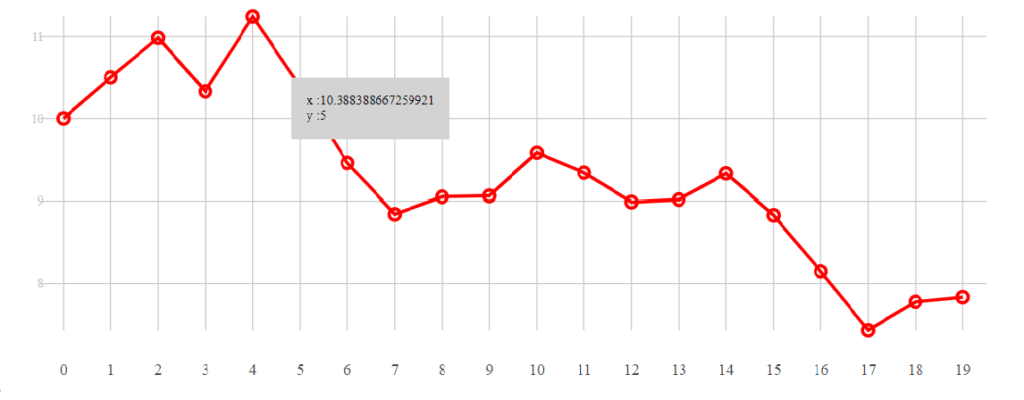
In LineMarkSeries component, we have defined mouse over and out options to show or hide the hint. The hint is basically the X and Y intersection datapoints that were defined in the datasets as shown in below graph.
We can define the CSS for cart components as per our requirements.
Check out https://uber.github.io/react-vis/#/ for all that can be done with react-vis. For LineMarkSeries, visit the documentation page at https://uber.github.io/react-vis/documentation/series-reference/line-mark-series
Author: Vandan Javiya
Vandan is leading technical team in Intelloger (https://www.intelloger.com) for Web and Mobile Technologies. You can reach him at [email protected]
About Intelloger
At Intelloger we always aim to provide you with solutions that can help you solve the most complicated problems you face while managing your business. From Oracle solutions to digital transformation, IoT and much more, we make it easier for you, just as we made this solution easy to understand and adapt.
For more information, contact us at [email protected]